Do our EHRs Need a Touch Bar?
I’ll admit it. I’m just gonna put it out there: I’m an Apple fan boy. Ok? It’s out there. I love everything about Apple: their no-nonsense aesthetic; their hardware and software connections; even their headquarters building in Cupertino, California. I think Apple is cool. Does my fascination with all things Apple mean that I overlook their warts and sub-optimal output from time to time? Yeah, to some extent, that’s exactly what it means!
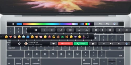
Recently, Apple introduced the Touch Bar with certain laptops. The Touch Bar is a high-definition multi-touch display that replaces the function keys that typically occupy the top row of the keyboard. The Touch Bar adapts to the software being used, so it’s always changing based on whatever the user is doing. Here are some examples of what you might encounter while using the Touch Bar:

It seems that the vast majority of Apple enthusiasts hate the Touch Bar. The most common complaint that I hear is that the Touch Bar is constantly changing based on what the user is doing and how it’s being done. While this might sound great, it makes it almost impossible to develop muscle memory, and without muscle memory, superusers don’t seem very super. Power users want repeatable and predictable motions to do the same thing every time, and the Touch Bar messes with that need.
Curiously, Apple isn’t showing any signs of getting rid of the Touch Bar because it’s popular with a different audience of theirs: developers. That’s right, software developers have found the Touch Bar to be a great way to make users aware of functionality that’s been there all along, but perhaps hasn’t drawn the desired attention. Maybe a user wasn’t aware that he could choose from many more than only a dozen colors for a font. Perhaps a writer didn’t know that she could leverage word completion on her laptop just as she does on her phone. There may be faster ways to get to these functions with a few key shortcuts, but if you didn’t know they existed, you can never invoke their power.
I think our complicated electronic health records (EHRs) could use something like a Touch Bar. As an avowed technophile (and as a full-time healthcare information technology leader), I know about many of the great tools that exist to help clinicians and administrative folks do their jobs faster and better. Here’s a smattering of what I hear about all day:
- Can’t find that serum potassium level? Did you type “K level” or “potassium” into the search box? What’s that you say? You didn’t know there was a search box.
- Annoyed that you always have to change the defaulted antibiotic for a commonly-used order set? Did you consider saving a personal version of that order set so that when you opened it up, it the preferred antibiotic was already checked?
- Irritated that instead of ordering an “HUS” (your abbreviation for head ultrasound), you have to search for “Ultrasound of head, <1 year”? Have you considered adding the order to your preference list and renaming it to “HUS” so you can search on that term?
These may seem like minor things, but they can contribute to physicians’ feelings of helplessness that they don’t control the tools they must use every day.
EHRs are often blamed as a key cause of physician burnout; I’ve written about both sides of this issue. Further, doctors aren’t always the best at knowing when they need more training and accepting that training. Acknowledging these facts, I wonder how our EHR vendors can do a better job of elevating new or particularly helpful functionality so that non-power users can be made aware of it and encouraged to use it. We CMIO-types know that sending out monthly e-mails with tips and tricks generally doesn’t move the needle. Same with a lunch-and-learn session. These types of outreach often attract those who are already good users – the rich get richer, so to speak. We need to incorporate software tools into the EHR to elevate and highlight functionality that doctors and nurses and support folks would love to use . . . if only they knew the functionality existed.

