

Over the course of the last few decades, data has become critical in understanding, maintaining, and improving business outcomes. Executives and business leaders need to quickly and efficiently understand the underlying information to make the correct decisions in operations. To address the need to process large amounts of data swiftly and effectively, we have developed modern dashboarding methods.
Modern dashboards are more than simple Excel charts of the past. Today’s dashboards can process large amounts of data in seconds, send alerts to changing data, utilize AI, and have many other beneficial functions that are needed in today’s competitive market.
 With all the advanced capabilities, you may be wondering, “Where do we start?”
It’s important to grasp the questions you want your dashboard to answer. This will provide the information needed to display in the form of your visualizations.
Next, ask yourself, “What level of information is required to answer my questions?” Once you answer your business questions you will need to understand how much information to show on your dashboard.
There are two types of dashboards: Exploratory and explanatory. Here’s what to know about each dashboard type and what it means for your business needs.
Exploratory Dashboards
Exploratory dashboards provide the greatest level of detail and offer the ability to dig into the data and explore the information for greater insights. This is important in areas where there are complex relationships between metrics that could use greater understanding. Other use cases might be to have a deeper understanding of the background data and how that aligns to the business questions.
This type of dashboard helps users draw conclusions for business questions and requires more technical knowledge to understand the greater complexity within the graphs and the features of the dashboard, and ultimately be more familiar with the underlying data and its nuances. While there are many possible use cases for exploratory dashboards, examples include using statistical analysis to predict future outcomes, analyzing products, and understanding characteristics of your customers.
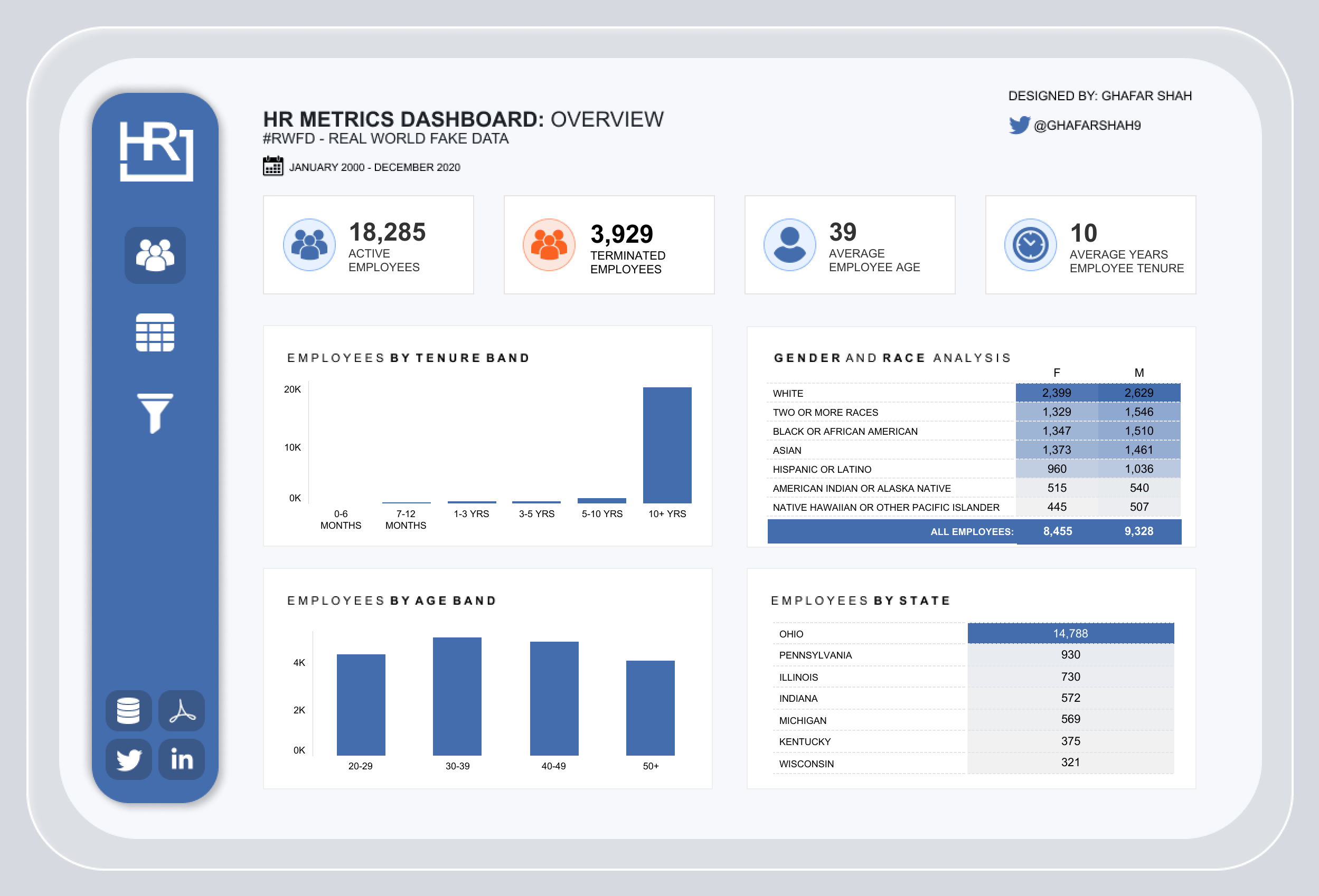
In this dashboard by Ghafar Shah, we can see that it has filters which allow the user to uncover information by different categories and many views that allow for different discoveries. Also, there is no text that gives us conclusions and we can drill down to a tabular view for a greater level of detail. This view can be used to find relevant information to the questions that need to be answered.
Explanatory Dashboards
Explanatory dashboards directly answer the questions at hand with fewer filters and can be understood quickly. The dashboard data has already been filtered and selected to the subset of information that gives the user the information requested without the need to find it for themselves. Explanatory dashboards have more wording and fewer graphics. You can make quick decisions without the need to filter and analyze the complex data.
Users that are less familiar with the data will generally prefer to have the information readily available. A limitation of explanatory dashboards is that they do not have the ability to dive deep into the data through filters and other graphs if more questions arise.
This type of dashboards could be informing the public about a current situation where only a high level of understanding is needed, snapshots in time that have no need to show future changes, or summary dashboards that would tell the data at a higher level of detail to make quicker decisions.
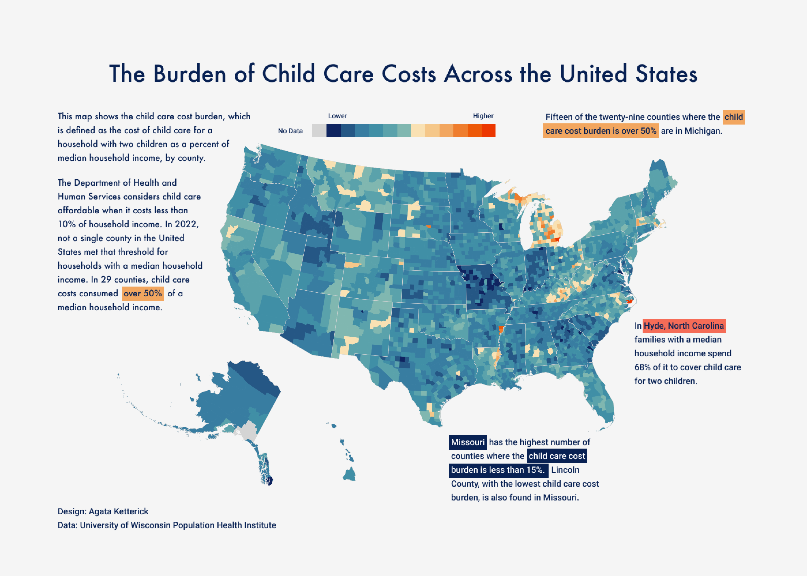
This example, an explanatory dashboard by Agata Ketterick, has no filters, large amounts of texts, and allows the user to quickly understand what is in the underlying data.
The Blend
Blended dashboards incorporate principles from both e exploratory and explanatory dashboard types. Blended dashboards provide the ability to see high-level, quick information, as well as the ability to drill down into the data. The benefit of blended dashboards is the ability to understand what is going on in the data quickly but also the ability to dig into the data when sudden changes occur. Most dashboards tend to use a certain level of blend when incorporating views into a dashboard. Different audiences might require different proportions of exploratory and explanatory elements.
Blended dashboards are the most used type of dashboard. It can be used for sales pipeline, education analysis, and HR purposes. Its versatility makes it the best option to see data and a high level of detail but when further questions are asked, it has the potential for the user to drill down to answer the questions.
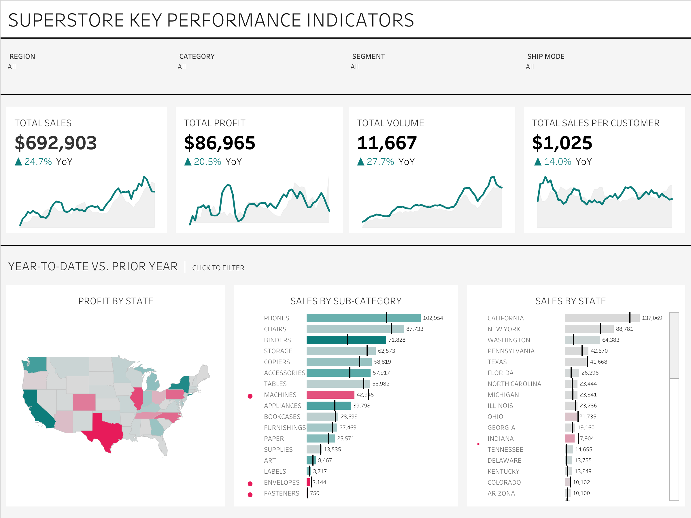
An example by Andy Kriebel demonstrates KPIs that show whether metrics are up or down from last year. The various filters and views allow the user to investigate increases and decreases further.
Understanding what type of dashboard works for your needs and articulating it is critical in the dashboarding process. Wasted time, budget misses, and frustration can result when the fundamental process of choosing the right dashboard type is overlooked. When picking the right dashboard, you can be assured that your dashboard will be able to be fully utilized and function according to business needs.
Michelle Rieser is a Tableau-certified senior analyst in Avaap’s Data & Analytics practice. Michelle turns data into information, information into insight, and insight into business decisions. Reach out to learn how your organization can begin turning data into actionable information to meet your business goals.